Here are my "politically incorrect" criteria to estimate quality:
1. Age and status of author. The older the researcher, the higher his seniority (e.g. being a professor), and him being first author, significantly increases the chance that the piece of research is irrelevant and wrong! There are several reasons: Older researchers or professor often become managers from their mid 40s onwards and leave the real research work to their students. Thus, they typically have not in depth thought about the research, are out of touch with new literature, and new techniques. They also live in a bubble in the sense that no-one dares to contradict them as they want to finish their PhD, get a letter of recommendation, or fear their influence on powerful research committees. Moreover, professors have often worked on one theory for 20 years, and find it emotionally very difficult to give up their theory as it means having wasted 20 years of their life on a wrong idea! Of course, there are also professor who defy this.
2. Not well known universities. The less well known the university the more likely the research and researchers are not very good. I have been at several universities during my career as a student and researcher, and there are clear differences. Of course, there are good people and research at not well known universities, but I were rarely see some.
3. Conflict of interest. If the author has a conflict of interest, the research is often suppressing weaknesses. A conflict of interest might be researchers who research the treatment approach they have themselves created, a pharmaceutical company pushing a product, a professor who is a strong supporter of a theory.
4. Too precise figure. This is a big warning sign. For example, if I read things like "74.1% of all children recover naturally", I know that the researchers are not very good scientists. This is the same as saying: we project that the building will cost 1'4637'748 Euro. The number is far too precise for the phenomena it describes. This criteria might sound trivial, but it shows that the researcher have not properly digested the number. So when I write about children stuttering, I just say 70 or 80% recover. Actually good scientists often quote LESS PRECISE figures than mediocre scientists!
5. Keyword "holistic", big name in PDS, "revolutionary", "cure". Good researchers never use vague terms. They also don't refer to big names like "Sheehan said that" or "Einstein said that". I am only interested in the argument itself and not who made the argument, at least not in a research article.
6. No quantitative background. I find that research (even if it is in soft sciences) by people who did not have a quantitative training is worse. They do not properly understand statistics and fall prey to logical fallacies much faster. During their intellectual developmental years, people with quant training, they were constantly faced with reality checks. If you miss a sign in an equation, the answer is wrong. If your thinking is sloppy, your computer code wont run. This made them aware of their own failings in terms of thinking. Good scientists constantly feel stupid and make mistakes. So when they approach subjects that are not very quantitative, they are much more suspicious and double check their thinking.
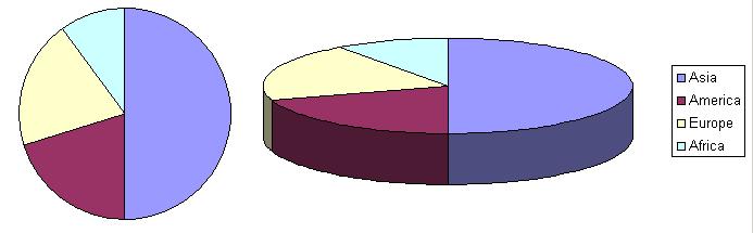
7. 3D graphs for 2D data. This is a big warning sign for me, but most people probably think I am a bit pedantic here. Often, non-scientists represent data in a very non-efficient way. For example, the share of each country in terms of population. See above, a circle would be enough to represent the data, but often a pie chart (3D) is used, even though the third dimension contains no information whatsoever. The key to finding new pattern is to only look at efficient visual representations. If you start a puzzle, you will also clean the tables and only keep the pieces and distribute them across the table.
8. No effect size is calculated. Imagine you want to find out whether people with PDS have a higher weight than the normal population. The standard procedure is to get two groups of about 20-30 people matched by age, sex, and so on, and weight them. Then for each group you have a distribution of weights, and you can perform a t-test to compare both distributions. This t-test will tell you whether the two samples could have come from the same distribution. It gives you a p-value which indicated how likely the difference between the two groups is due to a statistical fluctuation i.e. whether the difference is only by chance. Typically, if p is lower than 5% or 1%, the likelihood of the difference being by chance is 1 in 20 or 1 in 100, and researchers talk about a statistically significant difference. And almost always the story ends here. But not only it is important to know whether the two distributions are different, but also how big the difference is. For example, the weight of people with PDS might only be 100 grams more, and is therefore negligeable as an effect. Therefore the effect size is computed and this is true measure of determining whether there is a strong signal.
9. Small samples and anecdotes. Too small sample or anecdotes are always a big warning signs. UNLESS it is a detailed case study.
No comments:
Post a Comment